


You need to optimize your website for mobile. Period.
Mobile has dominated web traffic for the last year or so. “In 2018, 52.2 percent of all website traffic worldwide was generated through mobile phones, up from 50.3 percent in the previous year,” Statista reports.
But what’s even more noteworthy is that mobile ecommence has been on the rise for the last hand-full of years. And as of the fourth quarter of 2017, “24 percent of all digital ecommerce dollars were spent via mobile devices,” according to Statista.
Consequently, any business that neglects mobile optimization, specifically on its checkout page, is going to miss out on a lot of potential customers and sales.
How To Optimize Your Mobile Checkout Page
Your checkout page is one of your site’s most important pages. Shoppers who get to this point are on the verge of converting. And yet, the fate of all too many shopping carts is to be left behind, abandoned.
Shopping cart abandonment is unfortunate and it happens for a variety of reasons. And while it’s impossible to eliminate the occurrence completely, there are design strategies you can employ to increase the number of shoppers who convert on your mobile checkout page.
Allow Users To Checkout As Guests
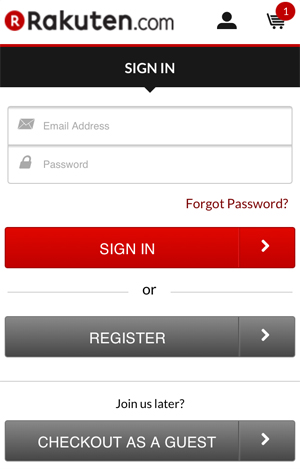
Getting customers to create an account with your site is obviously desirable. But requiring customers to sign up before they’ve bought anything significantly slows down the purchasing process and can be a source of frustration, especially on a mobile device.
So give people two options upfront: either create an account or checkout as a guest. This way, if people are shopping while on the go, they can complete their purchases with one less step, one less hurdle. Plus, you can always present customers with another opportunity to sign up after they’ve checked out.
Just make sure shoppers don’t have to scroll or go to another page to view the guest checkout option; it should be visible on the first screen in portrait mode.
Allow For Cart Management
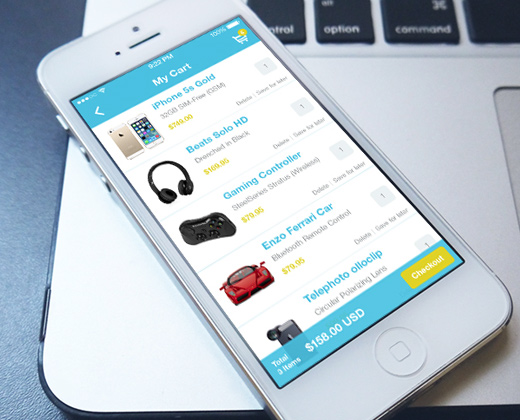
A common ecommerce practice is for shoppers to add items to their carts in order to save them for later. Shoppers may not realize the total cost of all the items they’ve added and the ensuing sticker shock may cause them to reevaluate their choices.
So, as a way of preventing shoppers from totally abandoning their carts, an effective strategy is to allow shoppers to edit their shopping carts directly from the mobile checkout page. You should obviously make it so shoppers can easily delete items from their carts. But they should be able to quickly adjust size, color, and quantity options as well.
Include A Progress Indicator
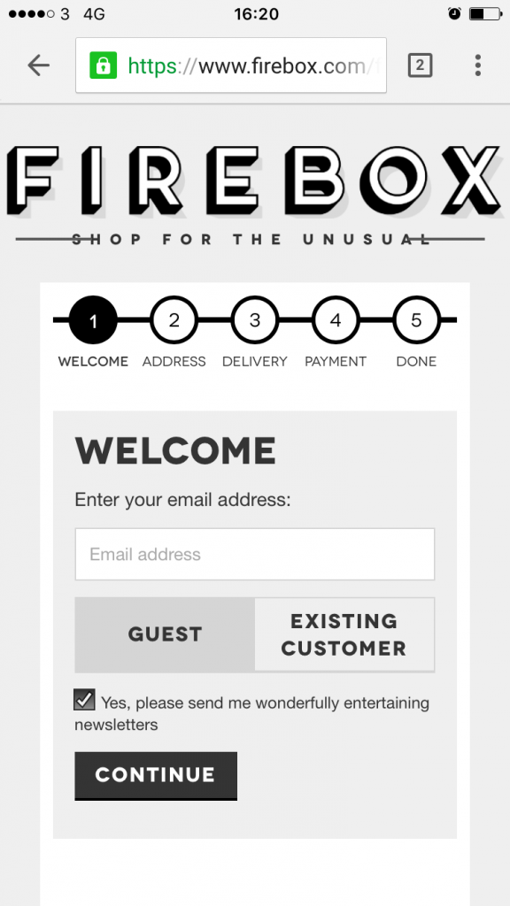
Progress indicators guide shoppers through the checkout process, letting them know exactly how many steps they have until they’re done.
Having the end point in sight like this makes shoppers feel more assured about the checkout process, especially when they’re shopping on the go, as shoppers are better able to gauge how long the process should take.
Also, when the completion of each step is indicated with a marker, such as a special icon, filled-in bubble, highlighted text, or a new button color, shoppers feel more confident because they know the checkout process is moving forward successfully.
In an ideal checkout scenario, however, you’d fit everything onto one page, as fewer clicks and fewer steps overall yield higher conversions. This isn’t always possible, though. But still, keep it in mind and make sure that every step of your checkout process is essential.
What do you think about these tips for mobile checkout screens? What are you doing to optimize your business’ checkout process on mobile devices? Get in touch and share your thoughts.