


Hundreds, if not thousands of elements go into designing a website, which means there is a lot of room for error. But according to Ginnie Mineo, “55% of visitors spend fewer than fifteen seconds on your website.”
So if any of your design elements are a turnoff to visitors, especially if they impact your site’s loading time, that could be a conversion death sentence.
To help save you from turning your site’s design into a disaster, below, you’ll learn about five common design mistakes and how to avoid them.
Using A Free Website Builder
If you search the web, you’ll find lots of sites offering templates and the means to quickly and easily build yourself a website.
And while this sounds enticing, and it certainly is a time-saver, the issue with these types of offerings is that these “drag-and-drop” websites tend to load more slowly. The reason for this is because “each design facet adds dozens of lines to the back-end code,” says Keith Koons.
So even though you may save some time on the front end, in the long run, you’ll end up losing customers when your site takes too long to load.
Including Too Many Large Images And Media Files
Another way to slow your site down and lose customers is to include images and videos that are too big.
Eye-catching images and video content are a great way to enhance the appeal of your site and make it feel more engaging. The opposite is true, however, if those media files load at the rate of drying paint.
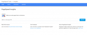
A quick way to tell if your media files are too big is by using the Google PageSpeed Insights test. Just input your webpage’s URL and then see if your page needs to be further optimized by reducing the size of any media files.
Omitting The Search Bar
The search function is important for every website, but especially if your site contains a blog.
Visitors may arrive at your site looking for something specific—a person’s name, an email address, content about a particular topic, et cetera. And for those instances, the ability to key in a unique search is often more efficient than relying on navigational features.

Google Custom Search is one tool you can add to your homepage to help visitors find what they’re looking for, and it’s free to sign up.
Having Orphan Pages
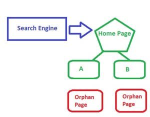
An orphan page is any webpage that doesn’t have an obvious means of navigating to another part of your website. Orphan pages are dead ends, which is bad because visitors may want more information but they won’t be able to find it.
Not everyone who comes to your site arrives via the homepage. Often, people forward URLs to their friends or family to check out.
And so, every webpage on your site needs to have an obvious means of returning to the homepage. This can be as simple as including a “Home” link at the top of every page.
Leaving Broken Links
This may seem obvious, and really, it should be. But you’d be surprised how many websites have broken links. Not only do broken links annoy visitors, they also communicate an unprofessional, untrustworthy, and not to mention lazy vibe. If you can’t be bothered to keep your site up to date, then why should visitors invest their time or money in your company?

Make it a habit to test your site regularly (once a week) for broken links and then fix them quickly whenever you find one.
What do you think of this list of common web design mistakes? Are there any other mistakes you would add? Or, if you’ve made one of these mistakes yourself, what impact did it have on your business? Get in touch and let us know!