


While browsing online, you’ve likely encountered your fair share of image sliders, which are also known as carousels or rotating offers. And you may enjoy viewing them—many people do. But putting aside the “cool” factor, image sliders can actually harm your conversion rates.
There are some CRO best-practice tips that are subjective or vary case by case. But overall, the consensus is that using image sliders is not a good idea. As appealing as some people may find them, the evidence against image sliders is compelling. “There’s literally not one study that I’ve found that says sliders are a good idea,” says Thijs de Valk of Yoast.
Check out the facts about image sliders below, as compiled by Thijs de Valk:
- “Only 1% of the people actually click on a slide, which almost always was the first slide;
- People simply ignore your slider, because it triggers banner blindness;
- They slow down your site, negatively impacting your SEO and conversion rate(!!);
- They don’t always work well on mobile devices,
- They push your content down, which Google recently mentioned yet again is not smart.”
Need more convincing?
Why Image Sliders Aren’t Effective With Most Users
There are three main reasons.
1. Human eyes react to movement.
This is a survival instinct. A sudden change or movement could be an imminent threat. And since we humans generally like to be aware of this type of thing in order to, ya know, not die, our eyes instinctively flick towards movement.
This includes constantly rotating image sliders and carousels.

And while this may seem like a good thing (you would want people to look at your slider, after all), if your slider is in constant motion, people have a harder time focusing on the rest of your website where your value proposition, product details, and call-to-action may be found.
2. Your message becomes diluted.
While their eyes may be drawn to them, most people don’t actually pay attention to the content of image sliders. And as previously mentioned, only 1% of people click on the slides and they generally click only the first slide.
Image sliders often move too fast for people to fully digest the content on each slide (that is, even if they wanted to understand the message). According to Peep Laja of ConversionXL, “Focusing on a single primary message and action is way always far more effective.”
3. Banner blindness
Banner blindness occurs when web visitors either consciously or unconsciously ignore information that resembles a banner or other form of advertisement. And since image sliders can look similar to banners, people often turn a blind eye to them.

In general, it’s to your advantage not to use an image slider, but if you really, really want to…
Image Slider Best-Practices
1. Make sure you genuinely need to use one and keep the slides to a minimum.
Every single piece of information does not need to be on your homepage. Therefore, you need to take an honest look at your content strategy and decide what information is truly deserving.
Don’t be like this…
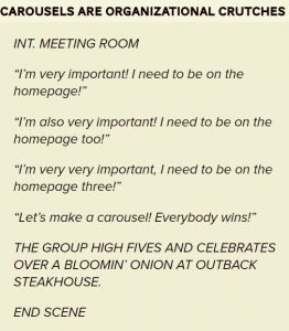
Making cuts can hurt, but it’s in your business’s best interest to do so.
2. The content should be relevant and flow in a logical, coherent order.
This may seem obvious, but it’s always beneficial to have an impartial person look at your slider to see if it can be easily understood.
3. Communicate how to navigate your slider clearly.
Make sure it’s apparent that your image slider is, in fact, an image slider that’s interactive. We’re talking arrows and clear ‘Previous’ and ‘Next’ buttons, as in the example below from Yahoo.

4. Offer additional content to users.
Don’t let visitors think your image slider is all your site has to offer. Use visual cues, such as arrows and scroll bars, to alert visitors that there is more to see off-screen.
What are your thoughts about image sliders? Do you use them on your website?