


Your store’s product pages have the ability to make or break your ecommerce conversion rates. Accordingly, each of your site’s products pages functions as prime digital real estate, which needs to be optimized.
Your product pages are where your visitors learn the most about what you have to offer. They’re where visitors decide whether to add your offers to their shopping carts and make a purchase. Your product pages need to be informative, engaging, and persuasive.
But how can you be sure your product pages meet these criteria? What elements do they need?
Below, you’ll find out exactly what goes into creating a high-converting ecommerce product page.
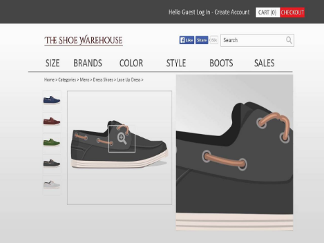
High-Quality Images
In order for your product pages to be effective, you need high-quality images.
Ecommerce shoppers don’t have the luxury of walking into your store and inspecting or experiencing your products first-hand before making a purchase.
So you need to convey as much sensory detail about your products through your product images as you can.
Here are three tips to improve your products’ imagery and make shoppers feel more comfortable about making a purchase:
- Capture your products from multiple angles (e.g. front view, back view, and side views).
- Show your products in use if possible (e.g. if you sell any kind of apparel, include images of models wearing your products)
- Include mouse-over zoom on your products so shoppers can get a closer look at your products’ details.
Clear, Honest, And Relevant Product Titles
A lot of companies try to be clever when naming their products. This approach can sometimes be effective, depending on your industry and niche. But often, it can lead to confusion among shoppers, as “clever” product names don’t always clearly convey what a product is or does.
To avoid missing out on potential sales, it’s best to title your products honestly and clearly. This also helps in terms of SEO and getting more people to find your products.
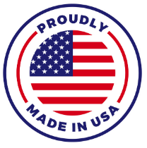
Icons As Opposed To Text
Typically, people skim more than they read online, and visuals are often preferred to text because information expressed in a visual format is easier to take in at a glance and it’s more engaging.
So to convey quick sound-bites of information about your products, such as how they include free shipping or how they’re made in the USA, you should highlight this information with icons rather than lines of text on your product pages.
Simple, Concise Product Descriptions
Again, sometimes shoppers find cute or clever descriptions to be entertaining. But more often than not, people want to scan product descriptions for benefits and key information about things like size, color, compatibility, and so on.
So keep your product descriptions on point, especially descriptions displayed above-the-fold or close to your calls-to-action.
You can include lengthier descriptions that dive deeper into what your products are all about further down the page if you would like. But the area closest to the top needs to be optimized for efficiency. This is going to help you increase your ecommerce conversion rates.
Call-To-Action
You want to have a super simple selection process on your product pages. Depending on your offer, you want to ask people to make only essential choices (e.g. choose your color, choose your size, choose your quantity). Then, have one final call-to-action about adding the item to the shopper’s cart or starting the checkout process.
Don’t clutter your product page with unnecessary calls-to-action, such as an “add to wish list” button or social share icons. Make the process of taking the next step as simple and streamlined as possible. This keeps people moving steadily though the checkout process and prevents people from dropping off.
What do you think of this post? If you have any questions or concerns about how to improve your ecommerce conversion rates, please use our contact page to get in touch!