


With conversion optimization the main goal is to remove friction points from your flow that can cause visitors to not take the desired actions you want them to take. We are simply leading the visitor down the path of least resistance to the end goal you want to be achieved. Think about ways you can make it easier for your visitors to buy from you.
In this particular case study, we have an ecommerce store pushing some heavy volume.
In their order process, they have the option to choose quantity as well as to save an additional percentage if they choose to get the product mailed to them on a schedule automatically.
Going through the data we found that there was indeed some friction in the process making it a bit cumbersome to make the selections, specifically on mobile which is 70% of this site’s traffic.
So what did we test?
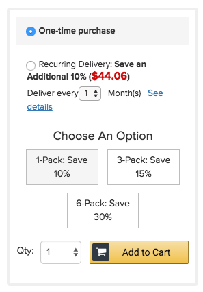
Above is the original page. As you can see the “deliver every” selection is small and has more text than needed with the “see details”. Quantity selection was a bit confusing as well giving them several options.
What we tested…
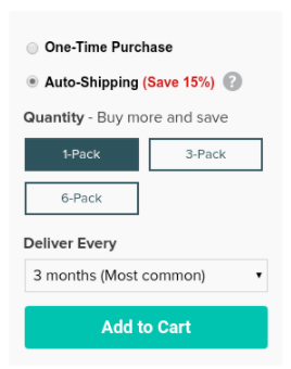
First, we made the price and savings a bit more obvious. Second is made it clear that it was auto-shipping versus using the language “Recurring”. We made the add to cart button bigger and more obvious and made the selection option stand out a bit more.
As you can also see in the second image, if they choose the auto option the delivery schedule is obvious and easy to select.
As part of this test, we made 1 month and auto-shipping the default selection.
The goal of this test was to simply make it easier to make selections and to navigate through the next steps.
And the results?
In this case, we are using Convert.com as our testing tool.
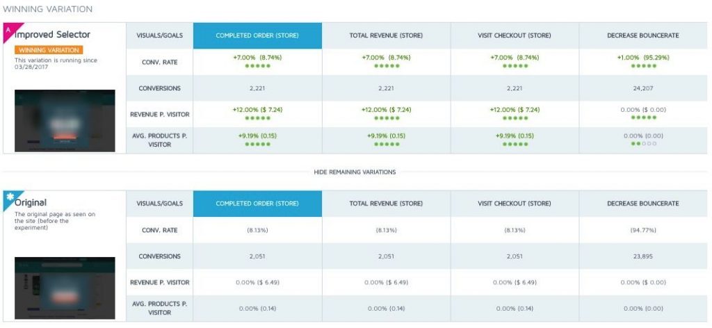
This particular test got over 40,000 unique visitors and over 2000 sales conversions. The winning variation was the new layout increasing revenue per visitor 12% and increasing overall sales by 7% at a 99% statistical significance.
We also lowered the bounce rate and increased the average product per visitor by over 9%.
Twelve percent may not seem like that big of a deal but considering this company has quite a bit of volume it will mean millions in additional revenue over the course of the year.
We do have some additional tests we are going to conduct on this area of the site to bring that number even more.
My question to you is… what are you doing to make it easier for your visitors to buy from you? Chances are the small things can make a big difference.
If you would like to get a custom game plan on what and where you should be testing on your site, reach out to us for a complimentary analysis.