


The name of the conversion game is to simply make easy for visitors to find what they are looking for and lead them down the path to take the desired action you want them to take.
This particular case study takes a look at a followup test we did on a test where we re-arranged an inventory page for a nationwide used car dealer.
Our first experiment switched the layout of the inventory page to widen the page to three column which increased conversions by about 24.5% on the main goal of submitting for approval for financing for the vehicle.
We saw some discrepancies on mobile so decided to test the “winning” variation again, removing the losing new layout design, making some iterations on mobile and expanding the layout changes to the vehicle detail pages.
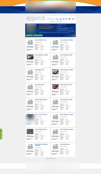
As you can see the original was a long two column option which didn’t really give any specific call to action as to the next step.
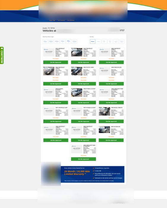
The first variation, which is a version of our winning variation on a previous test, expanding the layout to 3 column, added a call to action next to each and allowed for easier filtering of the page details, we also made the phone number more prominent at the upper right.
To expand it to the vehicle detail pages we must first look at the original detail page.
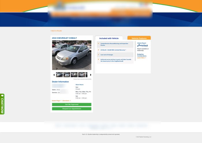
This page although simple was a bit distracting to the visitors and left them confused according to the heatmaps.
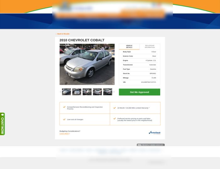
With the new variation we simplified the details of the vehicle and the local dealership selected by zipcode. We took the benefits including on each vehicle and put them as simple bullet points as well as made the main call to action stand out.
To accomplish this test we actually had to do a multi-step experiment since we were making more than one change to multiple pages in the process.
The results showed to be that we were on the right track for the changes made.
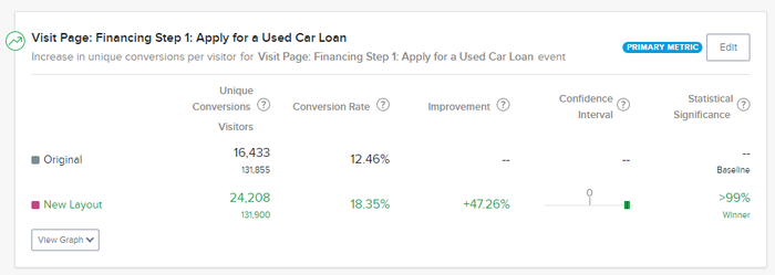
The main goal for this experiment was to measure the impact on those that actually submitted the application to apply for financing.
As you can see after about 260,000 visits we recorded about 40,600 conversion with the new layout producing a 47.26% improvement overall with over 99% confidence.
Basically an increase of over 7700 high quality potential customers for this company all because we followed the visitors behavior on page and tested to make it easier for them to find what they were looking for and give them the steps we wanted them to take to complete the process.
The big lesson here is that you need to pay attention to how your visitors are interacting with your pages using heatmaps and click maps. Don’t just test one element, learn from the data, test your best estimate on how you should improve and iterate and re-test based on the data collected from those tests.
What areas of your site could you streamline to make it easier for your potential customers to do business with you and how can you make the steps needed blatantly obvious?
We still have some more tests to do on this process as we need to incrementally test to see what changes actually had the biggest impact, but for now we will take the 47% increase.