


For many companies, the main purpose of their business is lead generation. With that, they leverage web-forms for their visitors to do anything from request more information, get a quote, get something of value and contact.
Today we are going to go through a case study of a company that lives by their lead generation and how by changing a few elements around their web-form increased the conversion, dramatically.
To set the stage, this company has several programs available that visitors can request more information. Each of these programs have separate landing pages. The problem and what setup our hypothesis for this test was that the form wasn’t customized to the program, it was simply their typical generic form.
With that, they had a form field that asked the visitor to select their chosen program from a dropdown. Since we already knew what program they were interested in by the landing page that form field was not necessary and was most likely causing friction.
So what did we actually do and what were the results?
First:
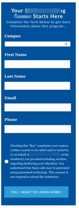
We customized the headline on the actual form to go as follows…
Your (PROGRAM BENEFIT) Starts Here!
Complete the form below to get more information about this program…
This was customized to the program that corresponds with the page they were on.
Second:
We removed the form field that asked which program they selected. For this, we hid the dropdown menu and had it pre-fill that value based on the program page they’re on to pass it to the CRM.

Third:
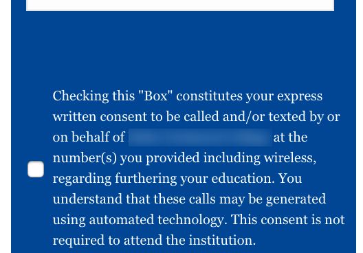
We cleaned up some formatting issues that come around the disclaimer to remove some of the additional space.
And finally:
We changed the button label to be more appealing. Instead of submit we put the label as “YES, I Want To Learn More!”.

A little recap before we talk about what happened in terms of results. Our hypothesis was that the form wasn’t congruent with the message plus the additional form field was causing friction. We edited the headline to match the program and landing page, we hid a form field, fixed some formatting issues and changed the button labels.
Now, normally we wouldn’t always test multiple changes at a time but felt that this would be of bigger benefit in the long run. If we failed, we could test the individual elements, which we will most likely do anyway.
The final form looked like this…
So what were the actual results from this experiment?

These changes actually resulted in a 72.9% increase in form submissions at a 97% confidence level taking the overall conversion from 5.03% to 8.7%. Pretty close to twice as many leads generated with just a few small changes.
How much would your business benefit from a 72% lift in new leads? Make sure you are paying attention to your visitors’ behavior on your site and look for possible friction points that can be causing problems in your results.