


Twenty-eighteen is the year to take risks, to branch out from the ordinary and shake things up with your website’s design. Make 2018 the year you ditch tired, formulaic patterns in favor of something fresh.
Below, you’ll discover four new design trends that can help make your website, and business, stand out from the competition.
Design Trends For 2018
1. Layouts With Broken Grids
If you’ve done much traveling, you know that navigating cities built with grid systems is a lot easier and more logical than navigating cities built with less orderly street arrangements.
Similarly, websites designed with grid layouts are typically easier to use and offer better UX than those that were otherwise designed—typically being the operative word.
It’s certainly not always the case, however. And one of the top design trends for 2018 actually breaks free (kind of) from the constraint of grid layouts, thus presenting more opportunities for creativity and engagement.
To clarify, layouts with broken grids don’t abandon the basic idea behind grid layouts altogether. Rather, “they allow images and text elements to drift into and across the gutters that usually serve as hard stops in more sober layouts,” says John Moore Williams.
Check out the image below:
As you can see, the grid system is still more or less intact. But certain elements have shifted left or right a bit.
2. Creative Fonts
While simple aesthetics have been the go-to, certain typography trends can make text stand out and feel more personal; they can also evoke emotion, thus having a more powerful effect on your branding.
Here three of the hottest font trends in 2018:
Geometric
Geometric fonts are serif- and filigree-free. Comprised of clean, straight lines, they have a distinctly modern, or even futuristic, feel to them, oozing class and sophistication. They are also easy to read from a distance, making them an especially good choice for branding purposes.
Handwritten
Handwritten fonts can be as diverse as each person’s signature, bringing unrefined charm to each design they adorn. They can range from loopy scripts to scratchy brushstrokes. Handwritten fonts make designs feel more personal and real.
Experimental Display
These fonts can turn text into works of art. They aren’t meant for all types of copy, however. Experimental display fonts work best for advertising purposes (not blog posts or any other longer pieces of text).

Notice how the display font above almost has a creamy, drippy quality, perfect for tantalizing customers into purchasing some ice cream.
3. Particle Backgrounds
Sites that incorporate video backgrounds are really engaging and eye-catching. Just take a look at this. However, the problem with video backgrounds is they can lead to performance issues, such as slow loading times.
Particle backgrounds, on the other hand, are attention-grabbing, motion graphics that still create a more memorable branding impression. But since they are “lightweight javascript that allow movement to be created as a natural part of the background,” they don’t slow down the loading process, says Lennart de Ridder.

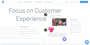
4. Integrated Animation
Speaking of motion graphics, another hot trend for 2018, which closely relates to number three on this list, is integrated animation.
In a world of ever-shrinking attention spans, integrated animation is a fantastic way to keep visitors entertained on your site for longer.
While particle backgrounds typically take up a lot of website real estate, integrated animations are usually smaller and used to engage visitors at various navigation points. For example, animations can play during loading times or operate with scrolling or while users hover over links or move their cursors around.
Here are three really cool websites that use integrated animations:
- Guccy SS 18 – Check out what happens while the site is loading (and the women’s sunglasses).
- Stinkmoji – Scroll and check out the different animals that pop up.
- Khenpo Sodargye – Notice the bouncing arrow beckoning you to scroll.
What do you think of these design trends? Have you implemented any of them on your website? If so, what results did you see?